paragraph in glyphs
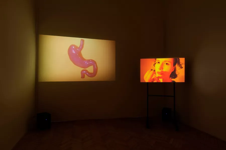
7. 6. – 25. 6. 2022
Kampus Hybernská, Praha
To better demonstrate the column-gap property, the flex items in this example have two different width values. The width of the flex items is set within the <div> flex items. We use the flex-basis component of the flex shorthand property to make all the flex items 200px wide. We then target every third flex item by using the :nth-of-type(3n) selector, widening them to 300px.